Once again I am back on Windows Phone
October 18, 2015I haven’t found my perfect “smartphone match” yet, so I am constantly and promiscuitively switching devices and ecosystems.
I have been a Windows Phone advocate for a long time, but the lack of support for my Pebble smart watch had made me switch to Android again (Galaxy Alpha) almost a year ago. As in my previous Android experience, I started to hate this device with a passion. Random crashes, lackluster battery life and sluggish performance made me trade it for an iPhone 5s. I was quite happy with it for a couple of months, but with Apple’s restrictions and lock-in obsession, it felt too much of living in a straitjacket. Also, with each week and month passing by, I noticed more and more how much I missed some of the features I had learned to love and appreciate on Windows Phone.
These are a couple of the Windows Phone features I missed the most and those alone were worth switching back to my Lumia 930 (which I had kept around in wise foresight).
- A consistent Back Button experience:
This was partly available on Android (at least devices have a back button) but it lacks consistency. On Windows Phone this is an essential feature and works across app boundaries.
The button situation on iOS is a disaster, frankly. Each time I had to push a tiny tiny “back” or “x” button somewhere on the corner of the screen, made me hate this device a little bit more. -
The Camera Button:
This feature is pure gold on Windows Phone. I can already push the camera button while I am getting the phone out of my pockets – ready for the perfect picture.
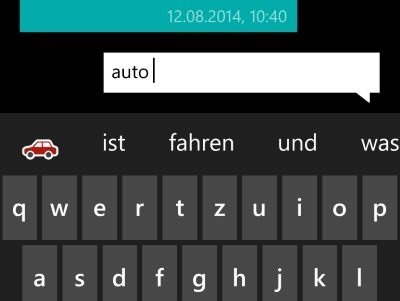
Again: partly there on Android (on some devices I guess, not on the one I used). On iOS: lackluster. - Auto Emoji correction: I like this one a lot and missed it badly. While you are typing, the auto correction system will automatically suggest suitable Emoji.

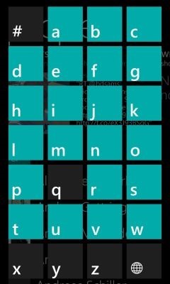
- Jump Lists: How anyone can live without them (and why Android and iOS haven’t already ripped off this feature) is beyond me. It is simply the most efficient way to navigate long lists (e.g contacts).

- Live Tiles: These are so incredibly useful, especially compared to a a static grid of icons. Androids widgets are similar. iOS will have them soon, you can quote me on that!
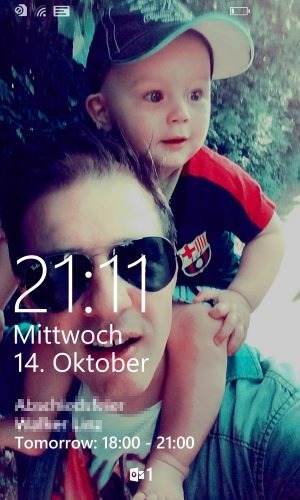
- Lock Screen / Glance Screen: One quick peek at the display gives me the relevant information to get through the day. I always have upcoming appointments or whole day events visible. This unobtrusive way of presenting relevant data is another feature I just couldn’t do without.

- The Contacts app: Neither Android nor iOS manage to get a decent contacts synchronization across ecosystems. With Windows Phone I can hook up the services I care for: Microsoft, Google, Apple, Facebook, Skype, LinkedIn, … heck even Yahoo, and it will merge their data smooth and nicely into a clean contacts app.
The initial problem (no app for the Pebble smart watch) has partly been resolved, since there is an unofficial app from Microsoft now. Unfortunately, Pebble does not show any signs of cooperation and has shut down Microsoft’s efforts of building a great Pebble experience on Windows devices.
At least this made it simple for me. Why would I punish Microsoft (and ditch Windows Phone) if Pebble are the actual a**holes in this situation? Right, I wouldn’t. So it’s gonna be Good Bye Pebble and “Hello Microsoft Band 2”, soon!