My Week with Android
August 19, 2013
TL;DR: After one week with a Nexus 4 Android smartphone I am back with my Windows Phone Lumia 920 - happier than ever.
Those of you who are following my blog have probably noticed that lately I hadn’t been too happy with Windows Phone’s current state and its pace of evolution. That combined with the fact that my Lumia 920 almost fell victim to the latest heat wave (I accidentally left it in my car for a whole day which nearly melted it) caused me to give Google’s Android smartphone OS another chance. After short deliberation which device to go for, I got myself a Google Nexus 4. This device has really nice hardware specs (1280 x 768 resolution, NFC, wireless charging, …) at a moderate price of 350€ .
After unboxing the Nexus 4 and powering it on, there was the first downer: I was noticing strange patterns on its screen.
This seems to be a common problem with the Nexus 4. Given certain angles and light conditions you will notice lines and squares on the display resulting from the touch panel’s digitizer. The extent to which this phenomenon occurs seems to vary from device to device. Apparently, the device I had was extremely affected by that phenomenon, to an amount that the retailer admitted an issue with it and exchanged it for another device. On the replacement device these “artifacts” were still visible but not that prominent anymore. However, I still considered this hardware issue quite disturbing and had never noticed something like that on any of the other smartphones I have owned so far.
The Good
So much for first time experience, but let’s continue with the positive aspects and some features I really liked about this new smartphone.
App Store: The ecosystem is terrific both in quantity and quality of the apps available. As a Windows Phone user I am not especially spoiled when it comes to apps and their quality, so this really is a big point in favor of Android.
Notification Center: That’s something which should have been in Windows Phone 8 from the beginning but just did not finish in time. Having used it on Android for a couple of days I totally see its usefulness and honestly find it hard living without it anymore. So please fix that, Windows Phone team.
Compatibility: I plugged my Beats by Dre ear buds into the Nexus 4 and was able to control the volume or accept calls with its hardware buttons. Something my Lumia device still refuses to do.
Performance: From previous experiences I still half-expected Android to be a sluggish and stuttering operating system. But luckily, these times seem to be over. The experience is fast and snappy (on the other hand: I really ought to, on that kind of hardware).
Screen Resolution: Apart from the mentioned artifacts and the generally lower quality of the display compared to my Lumia 920 Windows Phone, the resolution of 1280 x 768 felt really nice.
The Bad
Taking these positive aspects into account, here is also a random selection of issues and features I did not like about Android, which quickly drove me back to Windows Phone.
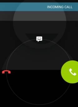
Accepting a phone call: This might sound strange but that actually was one of the things I found most disturbing on Android. Having to swipe to the right to accept a call feels weird after being conditioned to just swipe up or tap the the screen for the last couple of years. Also it’s a really error-prone gesture, especially when trying to accept a call without looking at the display. I probably dropped half of the calls I got due to this strange “usability” decision.
Home Screen and App List: It turns out I was really missing Windows Phone’s Live Tiles. While they still need a bit of improvement and more interactivity as I noted here, Live Tiles are a superior concept compared to plain old grids of folders and icons. These have been around long enough now, haven’t they?
Contacts App: This one is a real mess. Merging duplicate contacts from different sources hardly works and the Facebook integration does not work at all even though it’s an option offered by the app. I don’t care what kind of beef Google and Facebook have going on currently but I just expect that to work like it did on my Windows Phone.
Email Client: Here’s another thing I found really annoying: I constantly had to scroll horizontally when I was reading Emails because they just did not fit into the mail app. I have absolutely no idea why this would be considered a good default behavior and I even noticed myself not reading my Email on the phone anymore because I found it way to cumbersome. Works on Windows Phone btw.
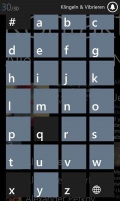
Long List Selection: This again relates to the contacts app, since this is the place where you need this feature most often, but I am mentioning it as a separate item because this is one of the features I was missing most coming compared to Windows Phone. There, finding contacts starting with a certain letter couldn’t be much simpler because of its neat jump list functionality. I simply expect a UI paradigm that simple and useful on all mobile platforms. If it’s not there, you’re doing it wrong.
Google Now: While the idea of your phone as a smart assistant sounds appealing, this is way too creepy currently. While its usefulness is questionable at best, I am really not comfortable with Google going through all my Emails, messages, appointments and whatever else they do. Especially considering Google’s latest confessions regarding their disrespect towards our privacy, Google Now is something I am not willing to sign up for.
Camera: Another thing I was missing from Windows Phone is the hardware button for activating the phone’s camera. This comes really close to the “your phone as your digital camera” metaphor which Nokia is successfully pushing these days.
Bottom Line
As you can see, there is no single big show stopper that makes Android as a smartphone platform unattractive to me. It’s more the death by a thousand cuts phenomenon that repelled me, meaning that none of the issues individually would have driven me away but the sum of them did. That, of course, paired with the fact that a full ecosystem switch is a quite painful endeavor nowadays, for which you need a compelling reason. Obviously, both smartphone platforms Windows Phone and Android have their strengths as well as their flaws but currently there is no real incentive for me to switching to another platform.
I realized that Windows Phone really is more personal, people-centric and content-centric and that’s what I like and appreciate about the platform.
So after this one week of my “Android Experience” I am back with Windows Phone (my Lumia’s heat damaged battery has partly recovered) and happier than ever with it. It turns out that this was yet another case where “the grass looked greener on the other side than it actually turned out to be”.
So farewell for now, you clumsy little robot. Until our next encounter.
[Image from http://thedroidlawyer.com/wp-content/uploads/2012/09/Sad-Android-Robot110.jpeg]


