A First Glance at the Visual Studio 2013 Preview
June 27, 2013I’ve had a couple of days now to look at the preview of Visual Studio 2013 but due to the usual NDA restrictions wasn’t allowed to blog about it. But now that it’s officially available let’s have a look at some of the innovations in our favorite IDE.
Synchronized Settings
This is a feature I have been really waiting for a long time now. Finally, the settings made in Visual Studio will roam among all installations on different devices. No longer fiddling with tab sizes, color themes, etc. when you install Visual Studio on a new PC. Everything will get configured as we configured it the last time. Nice!
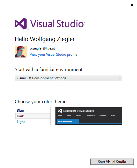
As it seems, these settings are associated with the Team Foundation Service (TFS) account, at least that’s where my profile picture (see screenshot) got picked up.
I yet have to install the Visual Studio Preview on a second device and check which settings are actually roamed and which are not.
Also, this will be an interesting feature for Plug-Ins. Will there be an easy way to opt in to settings roaming?
The Shell
Visual Studio 2013 still sticks with its reduced and simplistic design language introduced in 2012, which I personally like a lot. Although some of the icons got brushed up and received a hint of accent colors. Icons that relate to files or folders on disk e.g. received a yellow-brownish accent color, which is quite clever as one immediately associates these icons with file based operations now.
Another area in the shell that has obviously changed is the upper right corner, which contains a feedback smiley icon, like we have seen in the Office preview software.
Additionally, indicated by the flag icon, there is now a dedicated notification area, which e.g. informed me about the possibility of installing the offline help. I am curious for which kind of notifications this area will be used. Updates?
The third area which is new in this preview version is the user account which relates to the roaming settings mentioned before.
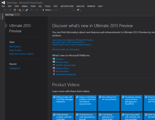
As expected, the start page provides us with a couple of links and videos also explaining the new features.
The Editor
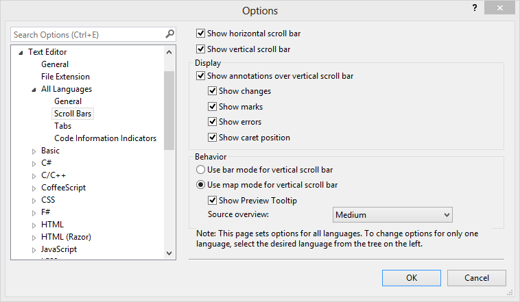
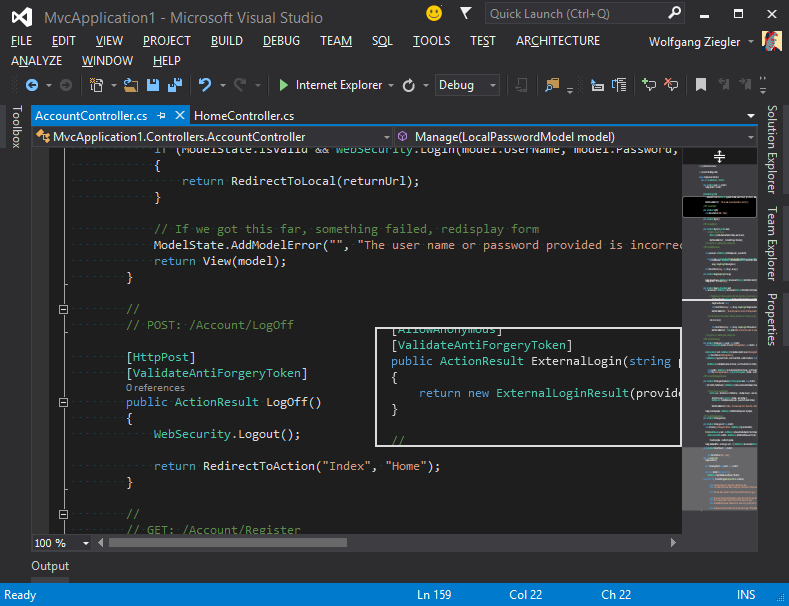
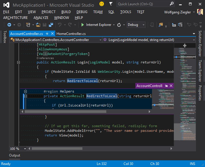
The editor has received some powerful enhancements. Right clicking the vertical scroll bar of the editor lets us enable map mode for the scroll bar, which gives us a preview outline of all the source code in a file. Combined with preview tooltips, this helps us to get a quick overview of large file.
The screenshot shows map mode in action.
In addition to “Go To Definition (F12)” there is now also a “Peek Definition (Alt+F12)” command, which, as its name suggests, gives you just a peek into a selected class, method, or variable instead of jumping to it. The next screenshot shows this feature in action.
The Debugger
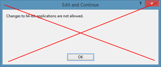
Another feature, many of us have been anxiously waiting for, has finally arrived. Edit and Continue Support for x64 applications works throughout all projects. This means that this dialog should be history now.
Finally! Thanks Visual Studio Team!
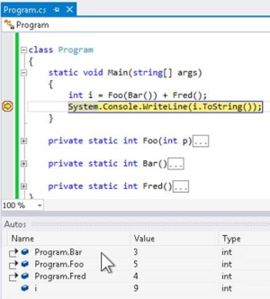
Another nice debugging innovation are return values of methods in the debugger’s Watch Window. Until now, if we wanted to see a calculated value returned from a method in the watch window, we had to store in in a local variable. Now return values of methods are automatically displayed in the watch window.
Also, there have been great improvements in async debugging and keeping the context of an async call available.
There’s More
These are just a couple of hand-picked features, which I personally discovered when working with the Visual Studio 2013 Preview (and watching the Build 2013 conference keynotes). Of course there are many more features with I haven’t covered yet. So, go - grab the bits yourself and check the new features out!
