Office 15 Preview – First Impressions
July 17, 2012Start the installation of the Office 15 preview here. On this web site your Office 365 Home Premium Preview account get set up, the installation bootstrapper is automatically downloaded and the Office 15 installation starts.
A basic design can be selected here. 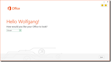 The new office is centered all around cloud services and online storage.
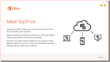
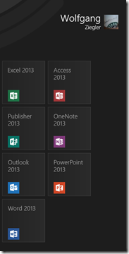
Some final things get “wrapped up”. 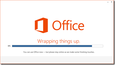 The office “program group” on the Metro start screen.
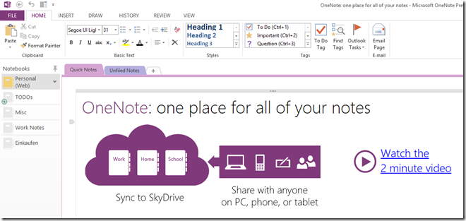
  All the office apps now feature a look and feel that is probably best described with “Metro for desktop apps” – a reduced, minimalistic, content-first, polished and modern user interface.
If we take a look at OneNote e.g. it can be seen that the user interface itself has not changed dramatically concerning the placement of ribbons and user interface elements but probably a lot of effort went into styling the products appropriately. Even all the icons got a make over and fit nicely into this polished Metro style user interface.
 The first impression is a great one – the product looks nearly finished to me. So starting today, I will switch from Office 2010 to this new version and start using the new apps on a daily basis.
